Wondering what secrets you need when using color in design? Many aspects of decor can affect the way you feel in a space. But color can also be key to whether a room calms you down or fires you up. In fact, Rachel Kapner, senior designer and principal at CWI, notes that when a client asks for color, they’re often asking for emotion.
“With a lot of clients. if they like color, they want saturation,” Kapner says. “This might be where you paint everything—the walls, trim—all the same color. That gives a sort of wrap of warmth that feels very inviting and cozy.”
And while warmth can refer to the emotion you feel encountering color, the term also has a more technical meaning when it comes to design. On a color wheel, the half with the reds, yellows and oranges is the warm colors.The other half—with the blues, greens and purples—is the cool colors. And since they can evoke reactions from stimulated to serene, it’s worth knowing what they signify.

Using Color That’s Warm
Red is bold. It can denote power (as in a throne room) or sensuality (as in the bedroom). Certain shades of red can be invigorating and even excite hunger. But because of its intensity, red is often preferable as a strategic accent.
Yellow can be a great way to open up small spaces or cheer up dreary ones. It’s often associated with feelings of happiness, and the right shade can help amplify natural light in spaces where it’s lacking. But be careful: the wrong shade of yellow can leave you feeling agitated, as in this famous story, The Yellow Wall Paper
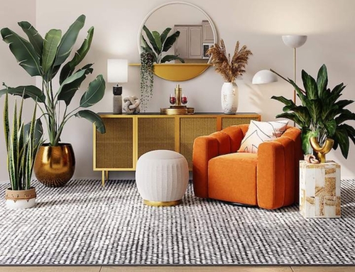
Though it’s famously the color of high-visibility vests and certain prison uniforms, orange can be also be used as a high-impact neutral. Like the fruit with which it shares its name, the color can nourish the soul. It may also promote creativity, energy and offer a sense of welcome.

Using Color That’s Cool
Blue is the only primary color that’s part of the cool family (and likely why they were called “cool” in the first place). It is known for imparting a sense of serenity—though this may be less the case with some of its more electric shades. Blue can also lend a connection to the great outdoors as it is the color of sea and sky.
Another color that connects to nature is green. Because it’s the color of fresh grass and budding leaves, green lends spaces a sense of freshness and vitality. Many people also find certain shades of green to be soft and soothing.
And while there are similarities between blue and green, Kapner notes that they tend to strike individuals differently. “Some clients are blue clients, and they’re not green clients,” explains Kapner. “It’s very unusual that you’d have a client that wants blue and green together because they tend to like one or the other.” And though these may be cool colors, Kapner reminds that they have warmer variants. “You could do a Tiffany blue, and that would be very warm versus ice blue,” says Kapner. “A deeper cobalt blue or navy could also be very warm.”
Purple is yet another cool color that also looks good in its warmer shades. Long associated with wealth and royalty, purple can lend space a sense of opulence. Darker purples tend to feel intense and dramatic; lighter purples can be more playful. And fans of romance will note that it is also a color that is associated with passion.

Using Blacks, Whites and Neutrals
When it comes to discussing color, black and white can be tricky. Some define them as the absence of color. Others say they contain all colors. Similarly, neutrals—even when technically colors—are often treated as the opposite of color. And all three have psychological implications for design.
At its best, black promises elegance and sophistication. But too much black can be funereal or ghoulish. If you want black to make the right impression, the trick is usually to pair it with a white or color that pops. Otherwise, it may leave a room feeling dark and sad.
White can also lean different ways. The right white can feel refreshing and clean. Its lightness often makes spaces feel bigger—making it a popular choice for ceilings. But using too much white or too harsh a shade can make a space feel clinical or devoid of personality. White is great at highlighting color: picture crisp white trim and molding on a colorful wall. But whether the results feel warm or cool may vary. “I have some clients that want white,” explains Kapner, “because they want it to be a light, blank canvas—very simple with pops of color. So white to them would be warm. But it actually could feel cool for someone else.” If your white space is feeling too cool, Kaopner recommends warming it up by injecting more color with elements such as artwork, sculpture and rugs.
Though often underappreciated, neutrals work to ground spaces—providing a sense of background calm and allowing more colorful elements draw the eye. But if you’re bored with beige and would rather not go gray, Kapner has some good news. “I know a lot of people saying grays are out, and beige hasn’t necessarily come back,” she says. Fortunately, now there is another option: greige. “Someone that doesn’t necessarily want a gray house, but they don’t want a beige house, I’ll put them into a nice greige. It’s a mix of gray and beige. And it does keep things light and warm.”

How to Make Decisions about Using Color
In part because of the psychological effects of color, Kapner understands that learning what colors are right for a client is about understanding their desires. “These are typically my go-to questions when I first meet a client,” says Kapner. “Do you want color? Do you want the walls to make a statement? Or do you want it to be in the background?” Answering these questions and understanding the effects that color can have are great first steps to using color well.
Enjoy these thoughts about color? Check out what Rachel Kapner and company have to say about the future.
Feeling inspired to make a change? Learn more about CWI design services.